CSS Learning
CSS (Cascading Style Sheets) is a styling language used to design and control the appearance of web pages. It defines layouts, colors, typography, spacing, and enhances the overall user experience.
Introduction to CSS
CSS (Cascading Style Sheets) is the language used to style and design the appearance of web pages. It controls how elements like text, images, buttons, and layouts look across different devices. CSS defines aspects such as color schemes, fonts, spacing, alignment, and responsive behavior.
By separating design from content (HTML), CSS ensures consistency, flexibility, and easier updates to the website’s appearance. It also supports advanced features like animations, transitions, and responsive design frameworks that help create modern, interactive, and visually appealing websites.
CSS Selectors
CSS selectors are patterns used to select and apply styles to specific HTML elements. They form the foundation of CSS, allowing developers to target elements based on their name, ID, class, attributes, relationships, or even their state.
Types of CSS Selectors:
-
Universal Selector (
*): Targets every element on the page.
* { margin: 0; padding: 0; } -
Type/Element Selector: Targets HTML tags directly.
p { color: blue; } -
Class Selector (
.): Targets elements with a specific class.
.btn { background-color: green; } -
ID Selector (
#): Targets a specific element with a unique ID.
#header { background: #333; } -
Group Selector: Apply the same style to multiple selectors.
h1, h2, h3 { font-family: sans-serif; } -
Descendant Selector: Targets elements nested within other elements.
nav ul li { list-style: none; } -
Child Selector (
>): Selects direct child elements only.
div > p { color: red; } -
Adjacent Sibling Selector (
+): Selects the immediate next sibling.
h1 + p { margin-top: 0; } -
General Sibling Selector (
~): Selects all following siblings.
h1 ~ p { color: gray; } -
Attribute Selector: Targets elements based on attributes.
input[type="text"] { border: 1px solid #ccc; } -
Pseudo-Class Selector: Targets elements based on their state.
a:hover { color: red; }(when hovered) -
Pseudo-Element Selector: Targets a specific part of an element.
p::first-letter { font-size: 2em; }
Example:
        /* Style all paragraphs inside a div */
        div p {
          color: #333;
          line-height: 1.6;
        }

        /* Style elements with class "button" */
        .button {
          background-color: #007bff;
          color: white;
          padding: 10px 20px;
          border-radius: 5px;
        }

        /* Style the element with ID "main-header" */
        #main-header {
          background-color: #222;
          color: white;
          padding: 20px;
        }
Mastering selectors is fundamental in writing efficient and maintainable CSS. The more precisely you target elements, the more control you have over the styling and behavior of your web pages.
Common CSS Properties
CSS properties define how HTML elements are styled and displayed on the web page. These properties control everything from color and typography to spacing, layout, and visibility. Mastery of these core properties is essential for effective web design.
Most Common CSS Property Categories:
-
Color & Background: Control the text color, background color, and background images.
color: #333;
background-color: #f0f0f0;
background-image: url('bg.png'); -
Typography (Fonts): Manage how text appears.
font-size: 16px;
font-family: Arial, sans-serif;
font-weight: bold;
line-height: 1.5;
text-align: center; -
Spacing (Box Model): Manage space inside and around elements.
padding: 20px;(inside content)
margin: 10px;(outside element)
border: 1px solid #ccc;(outline element) -
Layout & Display: Control how elements are placed and behave in the flow.
display: block | inline | flex | grid | none;
visibility: visible | hidden;
position: static | relative | absolute | fixed | sticky;
z-index: 10;(layer order)
Example:
/* Styling a card */
.card {
  background-color: #fff;
  color: #333;
  font-family: 'Segoe UI', sans-serif;
  padding: 20px;
  margin: 10px;
  border: 1px solid #ddd;
  border-radius: 8px;
  display: block;
  box-shadow: 0 2px 5px rgba(0,0,0,0.1);
}
These properties form the backbone of CSS styling. A strong understanding of how to use them effectively enables developers to build clean, responsive, and visually appealing web interfaces.
Pseudo-Classes & Pseudo-Elements
Pseudo-classes and pseudo-elements are powerful CSS features that allow you to style elements dynamically without adding extra HTML or JavaScript.
🎯 Pseudo-Classes (`:`)
Pseudo-classes target an element based on its state, position, or interaction.
| Selector | Description | Example |
|---|---|---|
:hover |
When user hovers over an element | button:hover { background: blue; } |
:focus |
When an element is focused (e.g., input field) | input:focus { border-color: green; } |
:active |
When an element is being clicked | a:active { color: red; } |
:first-child |
Targets the first child inside a parent | p:first-child { font-weight: bold; } |
:last-child |
Targets the last child inside a parent | li:last-child { color: orange; } |
:nth-child(n) |
Targets the nth child | li:nth-child(2) { color: blue; } |
:not(selector) |
Excludes certain elements | div:not(.special) { background: lightgray; } |
:checked |
For checked inputs like checkboxes | input:checked { accent-color: green; } |
:disabled |
Styles disabled inputs | button:disabled { opacity: 0.5; } |
✨ Pseudo-Elements (`::`)
Pseudo-elements let you style parts of an element (like the first letter or line) or insert content before/after.
| Selector | Description | Example |
|---|---|---|
::before |
Inserts content before an element | h2::before { content: '👉 '; } |
::after |
Inserts content after an element | h2::after { content: ' ✅'; } |
::first-letter |
Styles the first letter of a block | p::first-letter { font-size: 2em; } |
::first-line |
Styles the first line of text | p::first-line { color: darkblue; } |
::placeholder |
Styles placeholder text in form fields | input::placeholder { color: gray; } |
::selection |
Styles the selected text | ::selection { background: yellow; } |
🧪 Live Practice Idea:
button:hover::after {
  content: " 👍";
  color: green;
}
Try combining pseudo-classes with pseudo-elements to enhance interactivity and visual detail!
Advanced Selectors & Logic
CSS allows you to apply styles conditionally using logical selector patterns like :not(), :is(), and :has(). These help you write cleaner, more powerful CSS without needing extra classes or JavaScript.
🟨 1. :not() – Negation (NOT)
Use :not() to exclude specific elements.
button:not(.primary) {
  background-color: gray;
}
This styles all buttons except the ones with class .primary.
🟩 2. :is() – Matches One Of (OR)
:is() simplifies complex selectors where multiple elements share styles.
:is(h1, h2, h3) {
  font-weight: bold;
  color: navy;
}
This applies the same styles to h1, h2, and h3.
🟦 3. :has() – Parent Has (IF/AND-like)
Supported in modern browsers, :has() lets you apply styles based on the presence of a child element.
article:has(img) {
  border: 1px solid #ccc;
}
This targets any <article> that contains an image inside it.
🟥 4. Combinators – Basic Logic Using Relationships
A B→ Descendant (B inside A)A > B→ Direct ChildA + B→ Adjacent SiblingA ~ B→ General Sibling
ul > li:first-child {
  font-weight: bold;
}
🧪 Practice Challenge:
Highlight only those div.card elements that contain a button:
.card:has(button) {
  box-shadow: 0 0 10px rgba(0,0,0,0.2);
}
This helps simulate "if this has that" logic in pure CSS!
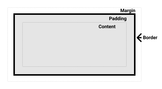
CSS Box Model
The CSS Box Model is the foundation of web layout. Every HTML element is considered a box made up of four parts:
- Content: The actual text or image inside the element.
- Padding: Space around the content (inside the border).
- Border: A line that wraps the padding and content.
- Margin: Space outside the border (space between elements).
📦 Visual Representation:
💻 Code Example:
div {
  width: 200px;
  padding: 20px;
  border: 5px solid black;
  margin: 30px;
}
This creates a box that is 200px wide, with padding inside, a border, and space outside (margin).
📐 Total Element Size Formula:
Total Width = content + padding + border + marginExample: 200px (content) + 40px (20 left + 20 right padding) + 10px (5 + 5 border) + 60px (30 + 30 margin) = 310px total width
🔧 Best Practices:
- Use
box-sizing: border-box;to include padding & border inside the total width/height. - Use browser dev tools (Inspector) to visualize the box model.
- Use margin for layout spacing, and padding for internal spacing.
✅ Helpful CSS Tip:
* {
  box-sizing: border-box;
}
This sets all elements to calculate width/height including padding & borders, making layout more predictable.
Typography in CSS
Typography refers to the visual styling of text. It plays a key role in readability, hierarchy, and aesthetics on your web page.
🧱 Basic Typography Properties:
font-family– Defines the font usedfont-size– Sets the size of the textfont-weight– Controls the thickness (e.g., bold)line-height– Adjusts the vertical spacing between linestext-align– Aligns text (left, right, center, justify)letter-spacing– Space between lettersword-spacing– Space between wordstext-transform– Controls uppercase/lowercase formattingcolor– Sets the font color
💻 Code Example:
p {
  font-family: 'Arial', sans-serif;
  font-size: 18px;
  font-weight: 400;
  line-height: 1.6;
  text-align: justify;
  letter-spacing: 0.5px;
  color: #333;
}
🎨 Font Families:
- Serif: Times New Roman, Georgia (formal)
- Sans-serif: Arial, Helvetica, Roboto (modern/clean)
- Monospace: Courier, Consolas (coding look)
- Custom Fonts: Use Google Fonts
🌐 Example: Google Font Integration
<link href="https://fonts.googleapis.com/css2?family=Roboto&display=swap" rel="stylesheet">body {
font-family: 'Roboto', sans-serif;
}📐 Best Practices:
- Use relative units like
emorremfor scalability - Ensure good color contrast for readability
- Limit the number of font families (max 2–3)
- Set a readable
line-height(1.5–1.6 recommended) - Use semantic tags (like
<h1>,<p>) for structure and accessibility
🔧 Tools:
- Google Fonts – For adding custom fonts
- Type Scale Generator – For consistent sizing
- Accessible Color Contrast Checker
🖼️ Visual Preview:

Colors & Backgrounds
In CSS, colors and backgrounds play a key role in design, helping communicate mood, brand identity, and visual hierarchy.
🎨 Color Formats in CSS:
Named Colors–red,blue,black, etc.Hex Codes–#ff5733,#000000RGB–rgb(255, 87, 51)RGBA– RGB with transparency:rgba(255, 87, 51, 0.5)HSL– Hue, Saturation, Lightness:hsl(12, 100%, 60%)
🧱 Common Properties:
color– Text colorbackground-color– Background color of an elementbackground-image– Add image as backgroundbackground-repeat– Repeat or no-repeat imagesbackground-position– Position image (e.g., center, top left)background-size– Control image size (cover,contain)background-blend-mode– Blend image and color
💻 Code Example – Solid Color
body {
  color: #fff;
  background-color: #1e1e1e;
}
🖼️ Code Example – Image Background
.hero {
  background-image: url('banner.jpg');
  background-size: cover;
  background-position: center;
  color: white;
}
🔄 Gradients:
CSS supports linear and radial gradients:
background: linear-gradient(to right, #0d6efd, #6610f2);📐 Best Practices:
- Maintain strong color contrast for accessibility
- Stick to your brand color palette for consistency
- Use variables in larger projects (with CSS Custom Properties)
- Avoid overusing gradients and flashy colors
🎯 Color Tools:
- Coolors – Color palette generator
- Color Hunt – Curated palettes
- CSS Gradient Generator
- Accessible Color Checker
🌈 Visual Preview:
Layout & Positioning
Layout and positioning are crucial in CSS for arranging elements on a web page. CSS provides various techniques to control the flow, alignment, and placement of elements — whether it's creating simple page structures or complex responsive designs.
Common Layout Techniques:
-
Flexbox (Flexible Box): A one-dimensional layout system for arranging items in rows or columns.
display: flex;
justify-content: center;(horizontal alignment)
align-items: center;(vertical alignment)
✔ Ideal for aligning items along a single axis (row or column). -
CSS Grid: A two-dimensional layout system for designing rows and columns.
display: grid;
grid-template-columns: 1fr 1fr 1fr;(three equal columns)
gap: 20px;(spacing between grid items)
✔ Perfect for building complex, responsive grid-based layouts. -
Float: An older method for creating layouts, primarily used for text wrapping or sidebars.
float: left;orfloat: right;
clear: both;(prevents overlap)
⚠️ Less common in modern CSS — replaced by Flexbox and Grid. -
Display Property: Controls how an element behaves in the document flow.
display: block | inline | inline-block | flex | grid | none;
✔ Essential for defining whether an element behaves as a block, inline, or flex/grid container.
Positioning Methods:
-
Static (Default): Default flow of the document.
position: static; -
Relative: Positions the element relative to its normal position.
position: relative; top: 10px; -
Absolute: Positioned relative to the nearest positioned ancestor.
position: absolute; top: 20px; left: 50px; -
Fixed: Positioned relative to the viewport. Stays in place when scrolling.
position: fixed; top: 0; left: 0; -
Sticky: Switches between relative and fixed depending on scroll.
position: sticky; top: 10px;
Example:
/* Flexbox Example */
.container {
  display: flex;
  justify-content: space-between;
  align-items: center;
}

/* Grid Example */
.grid {
  display: grid;
  grid-template-columns: repeat(3, 1fr);
  gap: 20px;
}

/* Absolute Position Example */
.box {
  position: absolute;
  top: 50px;
  right: 30px;
}
A solid understanding of layout and positioning enables developers to create responsive, well-structured, and visually balanced web pages. Modern CSS encourages the use of Flexbox and Grid for robust and flexible layouts.
Flexbox
Flexbox (Flexible Box Layout) is a powerful CSS layout module that makes it easy to create responsive, one-dimensional layouts. It helps align and distribute space among items in a container, even when their size is unknown.
📦 Flex Container Properties:
display: flex;– Activates Flexbox on the containerflex-direction– Row (row), Column (column), etc.justify-content– Horizontal alignment (start, center, space-between, etc.)align-items– Vertical alignment (stretch, center, flex-start, etc.)flex-wrap– Allows wrapping of flex itemsgap– Adds space between items
🧱 Flex Item Properties:
flex-grow– Defines how much the item will grow relative to othersflex-shrink– Defines how items shrink when space is tightflex-basis– Initial size before space distributionalign-self– Overridesalign-itemsfor individual itemorder– Reorders items visually
💻 Example Layout:
.container {
  display: flex;
  flex-direction: row;
  justify-content: space-between;
  align-items: center;
  gap: 1rem;
}

.item {
  flex: 1;
  padding: 20px;
  background-color: #0d6efd;
  color: white;
}
👀 Visual Preview:
🎯 Use Cases:
- Navigation bars
- Card grids and layouts
- Media objects (image + content)
- Centering content vertically and horizontally
🛠️ Tools to Visualize Flexbox:
- Flexbox Froggy – Interactive game to learn flex
- CSS-Tricks Flexbox Guide
- Flex Cheatsheet
CSS Grid
CSS Grid is a powerful 2D layout system that allows you to create complex, responsive designs using rows and columns. It offers more control over layout structure than Flexbox (which is best for 1D layouts).
🔧 Grid Container Properties:
display: grid;– Enables grid layoutgrid-template-columns– Defines the number and width of columnsgrid-template-rows– Defines the number and height of rowsgap– Space between rows and columnsjustify-items– Horizontal alignment of grid itemsalign-items– Vertical alignment of grid items
🔧 Grid Item Properties:
grid-column– Span or start/end column placementgrid-row– Span or start/end row placementjustify-self– Aligns an item horizontallyalign-self– Aligns an item vertically
💻 Basic Grid Example:
.grid-container {
  display: grid;
  grid-template-columns: repeat(3, 1fr);
  gap: 1rem;
}

.grid-item {
  background: #0d6efd;
  color: white;
  padding: 20px;
  text-align: center;
}
👀 Visual Preview:
🧠 Advanced Grid Features:
grid-template-areas– Name areas for semantic layoutminmax()– Responsive resizing with limitsauto-fitandauto-fill– Flexible gridsfrunit – Fraction of available space
🎯 Use Cases:
- Page layouts (header, sidebar, content, footer)
- Galleries and image grids
- Dashboard interfaces
- Forms and data tables
🛠️ Helpful Resources:
- Grid Garden – Interactive CSS Grid Game
- CSS-Tricks Grid Guide
- Layoutit Grid Builder
Responsive Design
Responsive Design is the practice of building websites that automatically adapt to different screen sizes and devices — from desktops to tablets and smartphones. The goal is to provide an optimal user experience regardless of the device being used.
Key Techniques for Responsive Design:
-
Fluid Layouts: Use relative units like percentages (
%), viewport width (vw), and viewport height (vh) instead of fixed pixels.
width: 80%;
height: 50vh; -
Media Queries: Apply CSS rules based on device width, height, orientation, or resolution.
Example:
      @media (max-width: 768px) {

        .container { flex-direction: column; }

      }
✔ Adjusts layout based on screen size. -
Flexible Images & Media: Ensure images scale within their containers.
img { max-width: 100%; height: auto; }
✔ Prevents images from overflowing on small screens. -
Mobile-First Design: Design for smaller screens first, then enhance for larger screens using media queries.
✔ Modern best practice for scalability. -
Responsive Frameworks: Utilize CSS frameworks like Bootstrap, Tailwind CSS, or Foundation that offer built-in responsiveness.
✔ Speeds up development with pre-made responsive components.
Example:
/* Desktop default */
.header {
  display: flex;
  justify-content: space-between;
}

/* Responsive for tablet and below */
@media (max-width: 768px) {
  .header {
    flex-direction: column;
    align-items: center;
  }
}

/* Responsive text size */
h1 {
  font-size: 3rem;
}

@media (max-width: 576px) {
  h1 {
    font-size: 2rem;
  }
}
Mastering responsive design ensures that your website looks professional and functions correctly on all devices, providing a seamless experience to every user.
Media Queries
Media Queries are a core part of responsive web design. They let you apply different CSS styles based on screen size, device type, orientation, and more.
📏 Why Use Media Queries?
- Make your site mobile-friendly
- Adjust layouts for tablets, desktops, and large screens
- Improve user experience on all devices
🔧 Basic Syntax:
@media (max-width: 768px) {
  body {
    background-color: lightgray;
  }
}
This code changes the background when the screen is 768px wide or less (usually tablets and mobiles).
📱 Common Breakpoints:
320px – 480px: Small devices (phones)481px – 768px: Medium devices (tablets)769px – 1024px: Large tablets/small desktops1025px and up: Desktops and large screens
💡 Example – Responsive Text:
h1 {
  font-size: 36px;
}

@media (max-width: 768px) {
  h1 {
    font-size: 24px;
  }
}
🔁 Example – Layout Switch:
.container {
  display: flex;
  flex-direction: row;
}

@media (max-width: 768px) {
  .container {
    flex-direction: column;
  }
}
🧪 Media Query Features:
min-widthandmax-widthorientation– portrait or landscapeaspect-ratio– for screens like TVshover,pointer– for input methods (mouse vs touch)
👀 Live Preview Example:
Resize your browser to see how the background and layout change based on screen width.
🛠️ Tools & References:
Z-Index & Stacking
The z-index property controls the vertical stacking order of elements on a web page. It's especially useful when elements overlap — such as modals, dropdowns, or popups.
🧠 What is Stacking Context?
HTML elements stack on top of each other in a 3D space (along the Z-axis). The default stacking order follows the HTML source order, but z-index lets you change it.
🔢 How Z-Index Works:
- Higher values = appear on top
- Only works on positioned elements (
position: relative, absolute, fixed, sticky) - Default value is
auto
💡 Example:
.box1 {
  position: absolute;
  z-index: 1;
  background: red;
}

.box2 {
  position: absolute;
  z-index: 10;
  background: blue;
}
In this case, .box2 will appear on top of .box1 even if it comes after it in the HTML.
📚 Visual Guide:
🚧 Common Use Cases:
- Modals or popups appearing above the page
- Dropdown menus and tooltips
- Sticky headers or fixed navigation
⚠️ Best Practices:
- Avoid using very large z-index values like 9999 unless necessary
- Use consistent z-index scales (e.g., 100, 200, 300)
- Be aware of stacking contexts — some CSS properties like
opacityortransformcan create new stacking contexts
🔗 Learn More:
Transitions & Animations
CSS Transitions and Animations add interactivity and visual feedback to web pages. They enhance user experience by making interfaces feel smoother, more dynamic, and engaging without relying on JavaScript.
CSS Transitions:
Transitions allow smooth changes between CSS property values when an event like hover or focus occurs.
-
transition-property: Specifies the CSS property to animate.
transition-property: background-color; -
transition-duration: How long the transition takes.
transition-duration: 0.3s; -
transition-timing-function: Defines the speed curve.
ease | linear | ease-in | ease-out | ease-in-out; -
transition-delay: Sets a delay before starting the transition.
transition-delay: 0.2s;
Example of a Hover Transition:
.button {
  background-color: #007bff;
  color: white;
  padding: 10px 20px;
  transition: background-color 0.3s ease;
}

.button:hover {
  background-color: #0056b3;
}
CSS Animations:
CSS Animations allow the creation of complex animations by defining keyframes. Unlike transitions, animations don’t require user interaction to start — they can play automatically or loop.
-
@keyframes: Defines the steps of the animation.
@keyframes slideIn { from { opacity: 0; } to { opacity: 1; } } -
animation-name: Name of the keyframes.
animation-name: slideIn; -
animation-duration: Length of the animation.
animation-duration: 1s; -
animation-iteration-count: Number of times the animation runs.
animation-iteration-count: infinite; -
animation-delay, timing-function, direction, fill-mode: Control advanced behavior.
animation-delay: 0.5s;|animation-fill-mode: forwards;
Example of Keyframe Animation:
@keyframes slideIn {
  from {
    transform: translateX(-100%);
    opacity: 0;
  }
  to {
    transform: translateX(0);
    opacity: 1;
  }
}

.box {
  width: 200px;
  height: 100px;
  background-color: #28a745;
  color: white;
  display: flex;
  align-items: center;
  justify-content: center;
  animation: slideIn 1s ease forwards;
}
Adding transitions and animations enhances the interactivity and feel of modern websites. When used thoughtfully, they can significantly improve user engagement without impacting performance.
CSS Variables (Custom Properties)
CSS Variables, also known as Custom Properties, allow you to store reusable values (like colors, spacing, or fonts) in a centralized and dynamic way. This makes your CSS cleaner, more maintainable, and easier to update.
🔧 Syntax:
:root {
  --primary-color: #0d6efd;
  --padding: 16px;
}
You define variables using the -- prefix inside a selector (usually :root for global use), and use them with var().
🎯 Usage:
button {
  background-color: var(--primary-color);
  padding: var(--padding);
}
👀 Live Demo Preview:
🏠 Why Use :root?
The :root pseudo-class targets the highest-level element (<html>) and is ideal for defining global variables.
💡 Benefits:
- 🧼 Cleaner and DRY (Don't Repeat Yourself) code
- 🌙 Easily implement dark/light themes
- 📏 Great for consistent spacing, colors, and sizing
- 🔁 Can be updated dynamically with JavaScript
📋 Example – Theme Switcher:
:root {
  --bg-color: white;
  --text-color: black;
}

[data-theme="dark"] {
  --bg-color: #121212;
  --text-color: white;
}

body {
  background-color: var(--bg-color);
  color: var(--text-color);
}
You can change the theme by adding data-theme="dark" to the <body> tag using JavaScript.
📚 More Resources:
CSS Tools & Frameworks
CSS tools and frameworks significantly enhance the workflow of web developers and designers. They help write cleaner, faster, and more maintainable code while providing pre-built components, utilities, and design systems that speed up development.
Popular CSS Frameworks:
-
Bootstrap: A widely-used CSS framework offering responsive grid systems, pre-designed components (buttons, navbars, modals), and utilities.
https://getbootstrap.com -
Tailwind CSS: A utility-first framework that lets you style directly within HTML using utility classes like
bg-blue-500orflex.
https://tailwindcss.com
✔ Highly customizable, modern, and lightweight. -
Bulma: A modern, lightweight CSS framework based on Flexbox.
https://bulma.io -
Foundation: A responsive front-end framework by Zurb, offering robust components and layout structures.
https://get.foundation
CSS Preprocessors:
-
SCSS / SASS: Extends CSS with features like variables, nesting, mixins, and functions, making CSS more maintainable and modular.
$primary-color: #007bff;
✔ Example:color: $primary-color; -
LESS: Another CSS preprocessor offering similar capabilities to SASS.
https://lesscss.org
Design & Prototyping Tools:
-
Figma: A web-based design tool for UI/UX design. It helps visualize layouts, collaborate in real-time, and export CSS-ready designs.
https://figma.com - Adobe XD / Sketch: Popular alternatives to Figma for creating wireframes, prototypes, and UI mockups.
Online Code Editors:
-
CodePen: An online community and editor for testing, building, and showcasing CSS, HTML, and JavaScript projects.
https://codepen.io - JSFiddle, JSBin, CodeSandbox: Other powerful online environments for experimenting with frontend code.
Leveraging these tools not only speeds up the development process but also ensures your CSS is clean, responsive, and maintainable. Mastering a combination of frameworks, preprocessors, and design tools is essential for modern web development.
Browser Compatibility
Browser compatibility means ensuring your CSS works consistently across different web browsers (Chrome, Firefox, Safari, Edge, Opera) and versions. Not all browsers interpret CSS the same way, especially with newer features.
🧠 Why It Matters:
- Ensures a consistent user experience
- Prevents broken layouts or missing styles
- Improves accessibility and reach to wider audiences
🧪 Common Compatibility Issues:
- Older browsers not supporting Flexbox, Grid, or CSS variables
- Vendor prefixes required for certain properties (e.g., gradients, transforms)
- Inconsistent rendering of input elements, buttons, or fonts
🔍 How to Check Compatibility:
- Can I use – Check support for any CSS feature
- Test in real browsers (Chrome, Firefox, Safari, Edge)
- Use browser dev tools for layout/debugging
🛠️ Tips for Better Compatibility:
- Use feature detection (via
@supports) for modern CSS - Use CSS resets like
normalize.cssto standardize styles - Add vendor prefixes if needed (can be automated with PostCSS or Autoprefixer)
- Stick to well-supported features when building for general audiences
💡 Example with Vendor Prefixes:
button {
  -webkit-transform: scale(1.1);  /* Safari, older Chrome */
     -moz-transform: scale(1.1);  /* Firefox */
      -ms-transform: scale(1.1);  /* IE 9 */
          transform: scale(1.1);  /* Standard */
}
🧪 Use @supports for Fallbacks:
@supports (display: grid) {
  .layout {
    display: grid;
  }
}

@supports not (display: grid) {
  .layout {
    display: flex;
  }
}
🔧 Helpful Tools:
- Can I use – Feature support checker
- Autoprefixer – Add vendor prefixes automatically
- BrowserStack – Cross-browser testing tool
Debugging CSS
CSS bugs can break layouts, cause visual glitches, or create inconsistencies across browsers and devices. Debugging helps identify and fix these issues to ensure your design works as expected.
🧠 Common CSS Issues:
- Elements overlapping or not aligning properly
- Styles not being applied (due to specificity or typos)
- Spacing and sizing problems
- Responsiveness not working as intended
- Unexpected default styles from browsers
🛠️ Debugging Techniques:
- Inspect Element: Use browser developer tools (right-click → "Inspect")
- Toggle Styles: Enable/disable rules to test layout behavior
- Check Specificity: Ensure your styles aren't being overridden
- Use Outlines: Temporarily add
outline: 1px solid red;to visualize element boundaries - Comment Out Code: Isolate issues by commenting sections line by line
💡 Example: Check Why Style Isn't Applied
/* Suspect that padding isn't applying */
.card {
  background-color: #fff;
  padding: 20px; /* Not working? Try inspecting it */
}
➡ Open dev tools → Inspect the element → Check if:
- Another rule is overriding it?
- There's a missing class or typo?
- It’s being affected by media queries?
🧪 Use DevTools Like a Pro:
- Layout Tab: Shows box model, margin/padding visually
- Computed Tab: Shows final values after inheritance
- Console: Use JavaScript to test DOM styling live (e.g.
document.querySelector('.card').style) - Network Tab: Check if your CSS file loaded properly
🔧 Debugging Tools:
- Chrome DevTools
- Firefox DevTools
- CodePen – Quickly isolate and test code
- CSSLint – Detect errors in your CSS
SASS (CSS Preprocessor)
SASS is a preprocessor that adds powerful features to CSS such as variables, nesting, functions, mixins, and more. It helps you write cleaner, modular, and reusable styles.
🔧 Key Features:
- Variables: Store colors, fonts, and sizes.
- Nesting: Nest selectors like HTML structure.
- Partials & Import: Split files into components.
- Mixins: Reuse groups of styles.
- Functions: Perform calculations or logic.
📄 Example:
// style.scss
$primary: #0d6efd;

.button {
  background-color: $primary;
  padding: 10px 20px;
  border-radius: 5px;

  &:hover {
    background-color: darken($primary, 10%);
  }
}
💡 Compile SASS to CSS:
Use a compiler like:
- VS Code Extension: Live Sass Compiler
- Command Line:
sass style.scss style.css - Online: SassMeister
LESS (Leaner Style Sheets)
LESS is a CSS preprocessor that extends the capabilities of CSS with features like variables, mixins, functions, and operations. It compiles into standard CSS and helps keep your styles modular and maintainable.
✨ Why Use LESS?
- Reusable code with mixins
- Easy theme management with variables
- Nesting similar to HTML structure
- Math operations for dynamic values
- Functions and logic with guards
💡 Basic LESS Example:
// styles.less
@primary-color: #0d6efd;
@padding: 10px;

.button {
  background: @primary-color;
  padding: @padding;
  border-radius: 5px;

  &:hover {
    background: darken(@primary-color, 10%);
  }
}
⚙️ Compiling LESS:
- Online: LESS Preview Tool
- Command line: Install LESS globally:
npm install -g less lessc styles.less styles.css - VS Code: Use "Easy LESS" extension for automatic compile on save
🧪 Example: Mixin for Buttons
.button-style(@color) {
  background: @color;
  border: none;
  padding: 10px 20px;
  color: #fff;
}

.primary-btn {
  .button-style(#0d6efd);
}

.danger-btn {
  .button-style(#dc3545);
}
📚 Learn More:
Dark Mode
Dark mode improves visual ergonomics by reducing eye strain in low-light environments. It's increasingly popular and expected by users.
🌓 How It Works:
- Detect user preference using
prefers-color-scheme - Toggle CSS classes with JavaScript or user control
🎯 Example (CSS only):
body {
  background: #fff;
  color: #000;
}

@media (prefers-color-scheme: dark) {
  body {
    background: #121212;
    color: #e0e0e0;
  }
}
🧩 Example (Toggle Class via JavaScript):
// JS
document.querySelector('#darkToggle').addEventListener('click', () => {
  document.body.classList.toggle('dark-mode');
});

/* CSS */
.dark-mode {
  background: #111;
  color: #eee;
}
🔗 Tip:
Allow users to switch manually even if their system is in light mode.
Performance Optimization
Optimizing CSS improves website speed, reduces load time, and boosts user experience.
⚡ Best Practices:
- Minify CSS: Remove spaces/comments using tools like CSSMinifier.
- Use Shorthand: Combine multiple CSS properties (e.g.,
margin: 10px 20px;). - Limit External Fonts: Only load necessary font weights.
- Avoid !important: Use proper specificity instead.
- Use Utility Classes: Reuse styles and reduce repetition.
- Defer Unused CSS: Use tools like PurgeCSS or Tailwind’s purge to remove unused styles.
🧪 Helpful Tools:
Practice Projects
Practicing CSS through real-world projects helps reinforce learning and develop problem-solving skills. Below are beginner-friendly projects that allow you to apply the concepts of layout, responsiveness, styling, and animations.
Recommended Practice Projects:
-
Create a Landing Page Layout:
Design a simple landing page with a header, hero section, about section, services, and footer. Apply CSS properties for spacing, typography, colors, and layout using Flexbox or Grid.
✔ Practice layout, typography, and color management. -
Build a Responsive Navigation Menu:
Create a navigation bar that adapts to different screen sizes. Use Flexbox for desktop and media queries to convert it into a hamburger menu for mobile.
✔ Practice responsive design, media queries, and positioning. -
Style a Photo Gallery with CSS Grid:
Build a grid-based photo gallery that adjusts based on the screen size. Add hover effects using CSS transitions or animations to enhance user experience.
✔ Practice CSS Grid, spacing, responsive images, and hover effects. -
Create a Card Component UI:
Design reusable cards with an image, title, description, and button. Implement hover animations and responsive scaling.
✔ Practice box model, shadows, border-radius, and transitions. -
Build a Simple Portfolio Website:
Develop a personal portfolio with sections like About, Skills, Projects, and Contact. Apply a responsive grid system and consistent styling.
✔ Combines all CSS fundamentals in a single project.
Bonus Mini Challenges:
- Create animated buttons with hover effects.
- Design a pricing table with CSS Flexbox or Grid.
- Make a sticky header that stays fixed while scrolling.
- Create a simple form with styled input fields and buttons.
Working on these projects will not only help solidify your CSS skills but also prepare you for real-world web development challenges. Each project introduces a new concept and gives you the confidence to build modern, responsive websites.
CSS Learning Roadmap
A clear learning roadmap helps you progress from CSS fundamentals to advanced topics in a structured way. Follow this step-by-step path to build strong CSS skills and create modern, responsive, and interactive websites.
Step-by-Step CSS Learning Path:
-
CSS Basics: Understand how CSS works, selectors, properties, and how to apply styles to HTML elements.
✔ Example: Styling colors, fonts, margins, and borders. -
Box Model & Display Types: Learn how padding, border, and margin create spacing, and how display types like
block,inline,inline-block,flex, andgridaffect layout.
✔ Foundation for proper layout design. -
Flexbox & CSS Grid: Master modern layout techniques. Flexbox is great for 1D layouts (row or column), while Grid handles 2D layouts (rows and columns together).
✔ Essential for creating responsive page structures. -
Responsive Design: Learn how to make your websites adapt to all devices using media queries, relative units (%, vw, vh), and mobile-first design.
✔ Critical for real-world web development. -
Transitions & Animations: Enhance your UI with hover effects, smooth transitions, and keyframe animations to create engaging user interactions.
✔ Adds life and interactivity to your designs. -
CSS Frameworks & Tools: Learn frameworks like Bootstrap and Tailwind CSS, as well as preprocessors like SCSS. These tools help write efficient, reusable, and scalable CSS.
✔ Boosts productivity and speeds up development.
Once you are comfortable with this roadmap, continue exploring advanced topics such as CSS variables, functions like calc(), CSS Grid areas, advanced animations, and modern workflow tools. Mastering CSS is a crucial step toward becoming a proficient frontend developer.
Test Your CSS Knowledge
Type a CSS declaration like property: value; to check if both the property and value are valid.